15 Bedroom Paint Colours That Turn Any Room Into a Sleep Sanctuary
Published: 19 Aug 2026
Choosing the right bedroom paint colours is one of the fastest, most affordable ways to transform a room that feels flat, cluttered, or hard to relax in. A single coat of paint can shift a bedroom from a place that simply holds a bed into a genuine retreat, without the cost or disruption of a full renovation.
The right shade does more than look good in photos. Colour affects how large or small a room feels, how well you sleep, and how easy the space is to style around existing furniture. That makes the choice worth slowing down for, especially since repainting is far less expensive than swapping out furniture or reworking a floor plan.
This guide walks through 15 bedroom paint colours for nearly every style and lighting situation, followed by planning tips, real cost ranges, a finish comparison table, maintenance advice, and answers to the most common bedroom paint colour questions.
Is a Bedroom Colour Refresh Right for You?
Before picking a shade, it helps to weigh the practical side of repainting a bedroom against the cost of other updates.
Reasons it’s a good fit:
- Low cost relative to other bedroom updates, typically 200 to 900 dollars for a full room
- Fast turnaround, often finished within a single weekend
- Low ongoing maintenance once cured, aside from occasional touch-ups
- Strong long-term value, since a well-chosen neutral or muted colour can last 5 to 10 years without feeling dated
Things to consider first:
- Bold or dark colours require more coats and more prep time, raising both cost and labour
- Small bedrooms and rooms with limited natural light are less forgiving of very dark or very saturated colours
- Rental units may restrict colour choices or require repainting back to a neutral before move-out
- Colour trends shift, so a very trend-driven shade may need repainting sooner than a classic neutral
1. Soft Sage Green
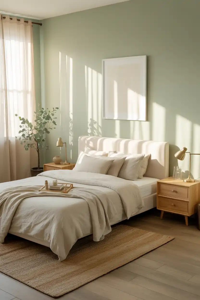
Sage green has become one of the most requested bedroom colours because it sits right at the intersection of calm and cozy. It reads as neutral enough to pair with almost any wood tone, yet it has just enough colour saturation to keep a room from feeling flat or clinical.
This shade works especially well in bedrooms that get plenty of natural light, since sunlight brings out its warmer, more herbal undertones. Pair it with cream or oatmeal linens, brass or matte black hardware, and natural fibre rugs to lean into an organic, spa-like feel.
Sage green suits people who want a restful bedroom without going fully neutral. It is a strong choice for primary bedrooms, nurseries transitioning to kids’ rooms, and anyone drawn to a nature-inspired palette.
2. Warm Greige
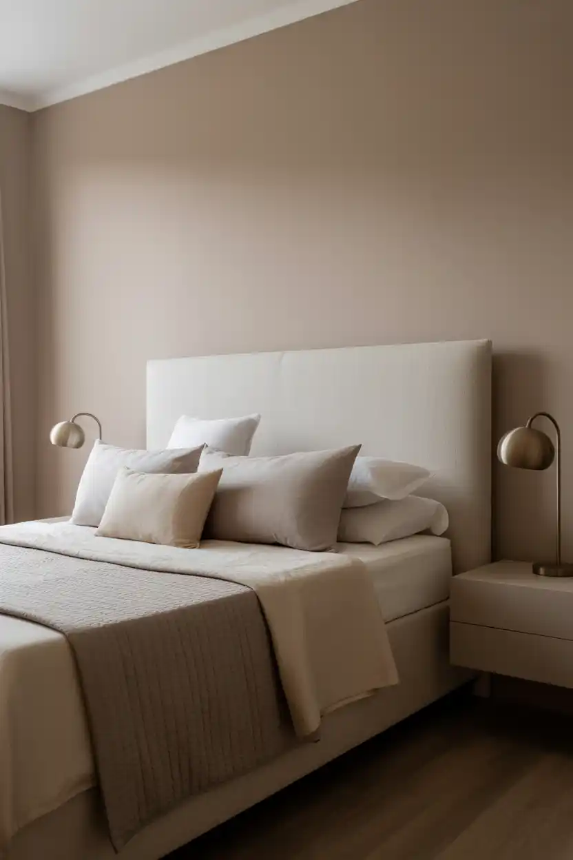
Warm greige, a blended gray-beige, remains a go-to because it photographs beautifully and adapts to almost any lighting condition. Unlike cooler grays, warm greige avoids looking sterile or cold, especially in rooms with north-facing windows.
It is an ideal backdrop for layered neutral bedding, textured throws, and a mix of matte and metallic finishes. Because it does not compete with colour, greige lets furniture and art take center stage, making it popular in bedrooms that double as a retreat from busier, more colourful living spaces.
This colour suits people who want a timeless, resale-friendly palette and plan to change out accessories seasonally rather than repaint often.
3. Deep Navy Blue
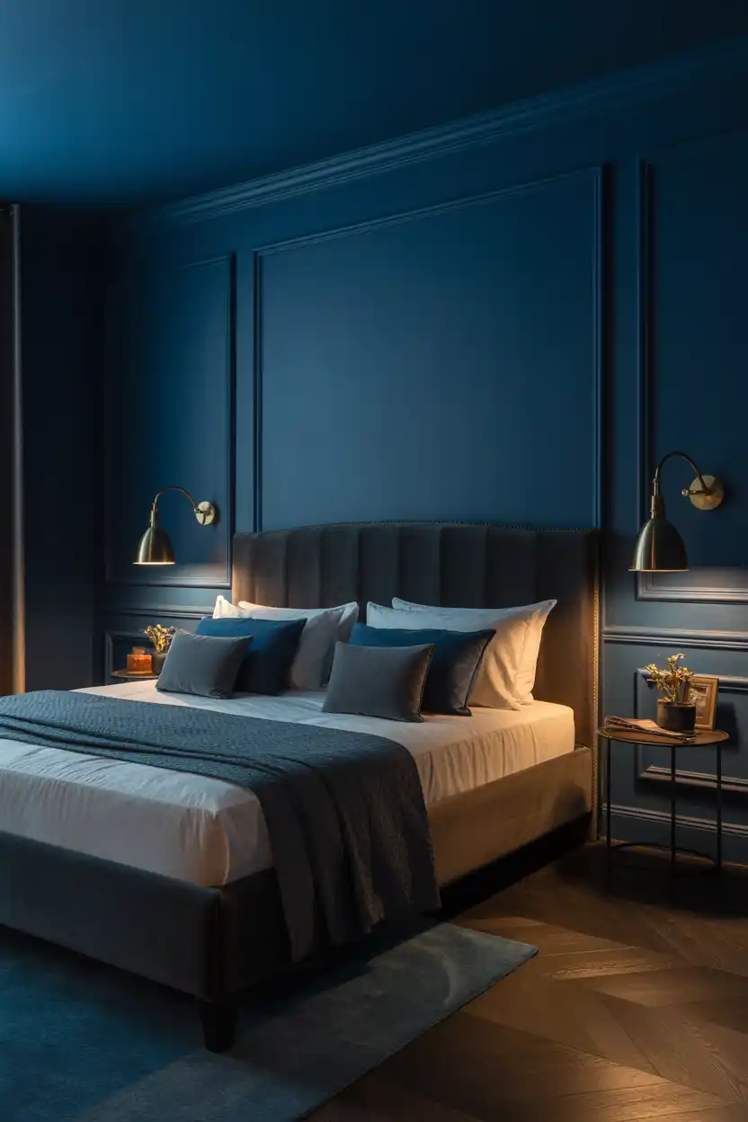
Deep navy is the colour choice for anyone who wants their bedroom to feel like a cocoon rather than a blank canvas. It absorbs light in a flattering way, making evening hours feel intentionally moody instead of just dark.
Because navy is a true colour rather than a neutral, it pairs best with warm metallics like brass or aged gold, plus texture-rich fabrics such as velvet or boucle to keep the room from feeling heavy. White or cream trim around windows and doors helps navy walls feel grounded rather than closed-in.
This shade suits larger bedrooms with good natural light or artificial lighting layers, and it is a favourite for primary suites where a hotel-like, enveloping feel is the goal.
4. Blush Pink
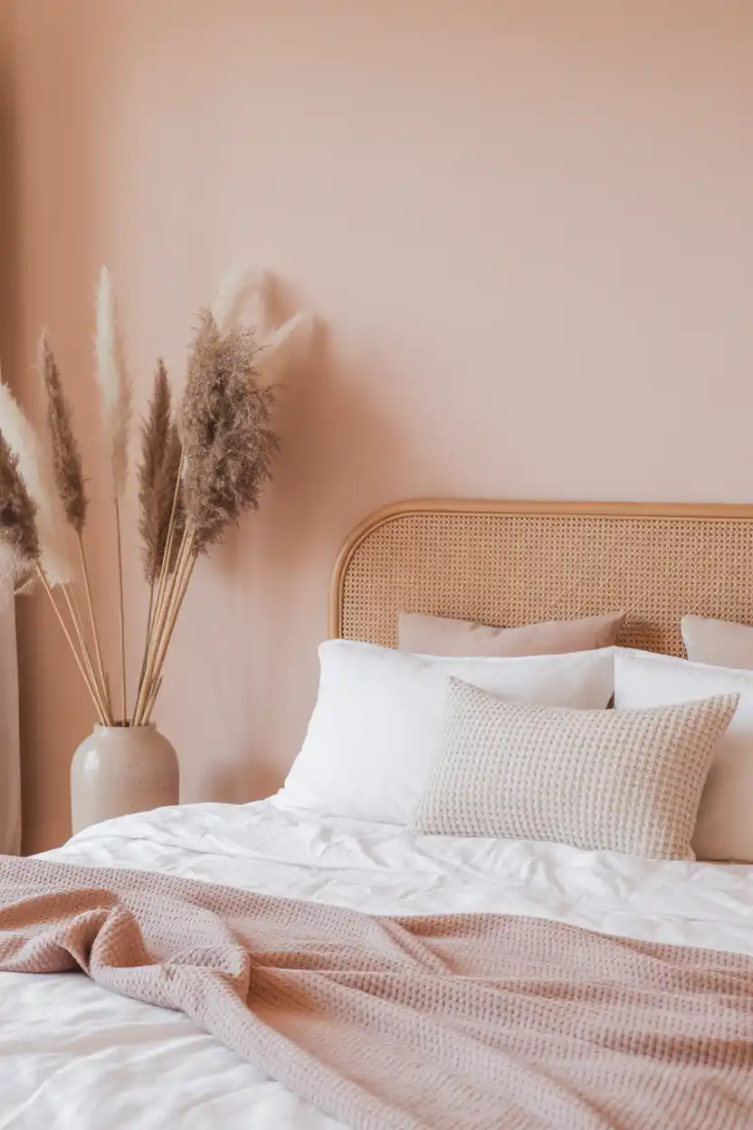
Blush pink has moved well beyond nursery decor and is now a popular choice for adult bedrooms looking for warmth without bold colour commitment. A dusty, muted blush reads as sophisticated rather than sweet, especially in matte or eggshell finishes.
It pairs naturally with warm woods, cream textiles, and brass fixtures, and it photographs particularly well in natural light, which is why it shows up so often in soft, romantic interior styling. Avoid pairing it with cool-toned grays, which can make the pink look chalky.
This colour works well for anyone wanting a gentle, calming palette that still feels distinctly styled, and it is especially popular in smaller bedrooms where a soft colour can make the space feel warm rather than cramped.
5. Charcoal Gray
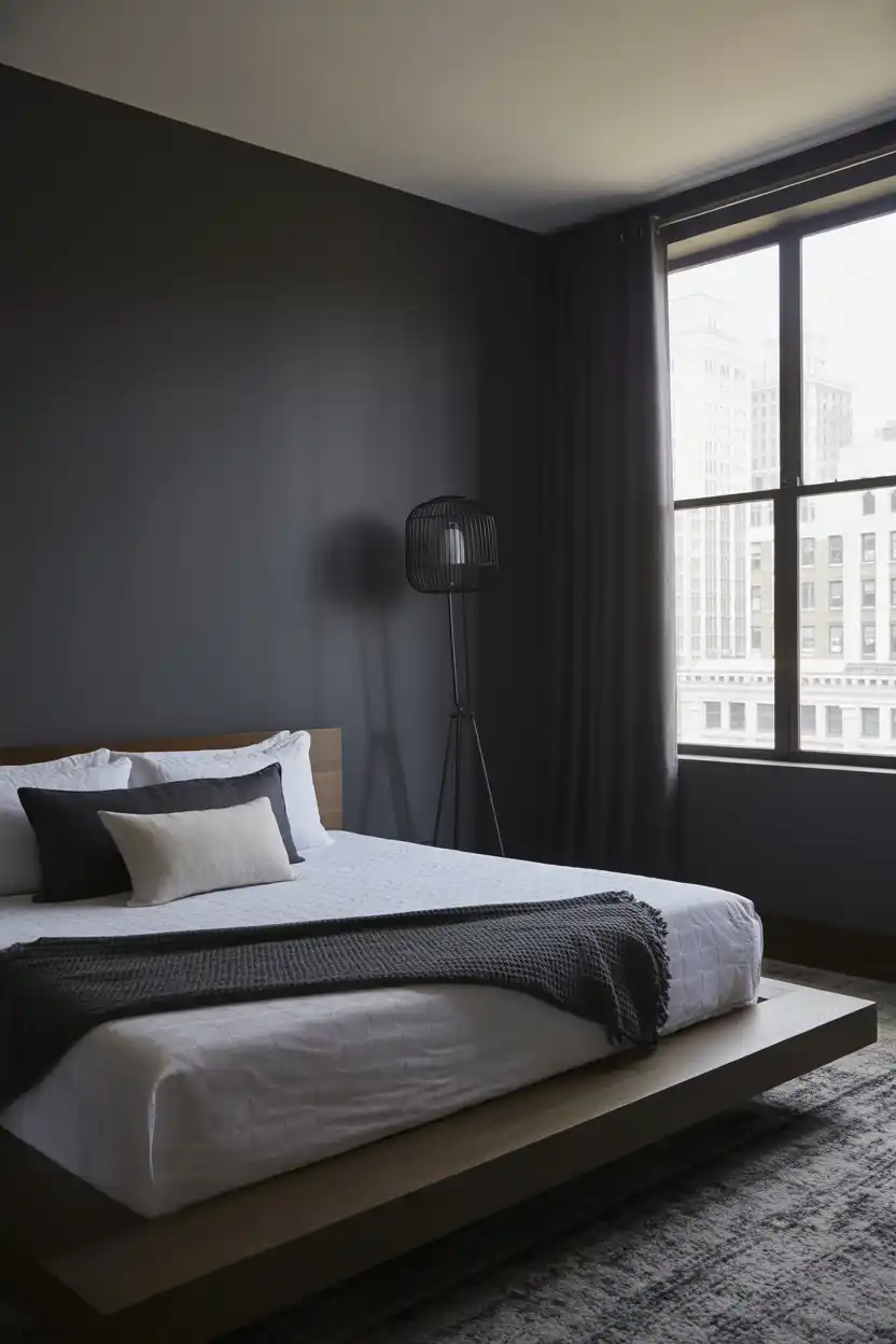
Charcoal gray gives a bedroom a grounded, architectural feel without the full drama of black. It is dark enough to feel intentional and modern, but still reads as neutral, which makes it easier to live with long-term than more saturated colours.
This shade pairs well with crisp white bedding and trim for contrast, or with warm wood tones for a softer, more organic look. Because charcoal can make a room feel smaller if used without enough contrast, it works best with strong overhead and lamp lighting.
Charcoal gray suits people who want a bedroom with a masculine or minimalist edge, and it is a strong fit for bedrooms with ample square footage or high ceilings.
6. Creamy Off-White
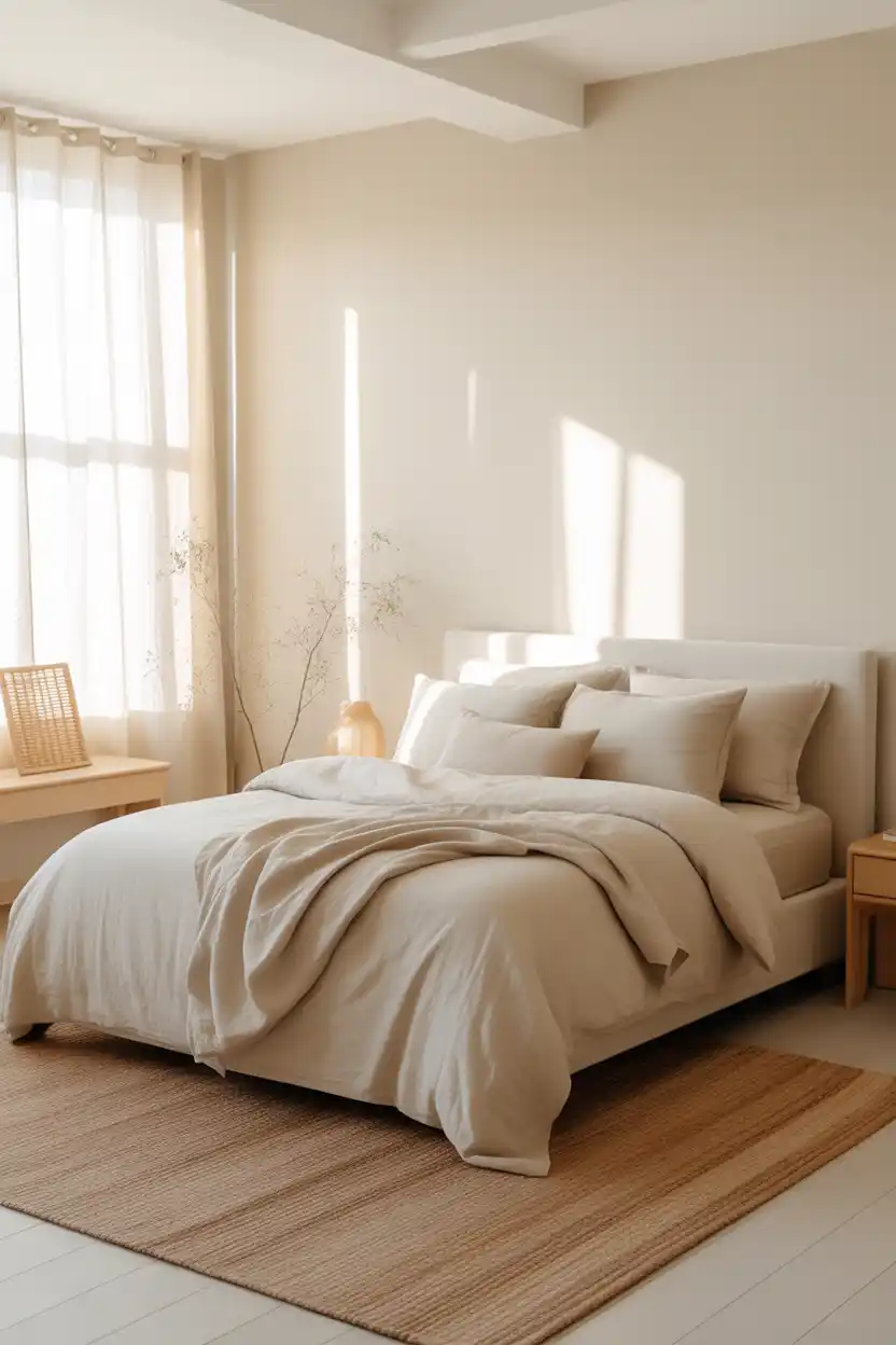
A creamy off-white is the safest and most versatile choice on this list, and for good reason. It reflects light well, making it a strong option for bedrooms with limited natural light, and it acts as a neutral backdrop for almost any furniture style.
Unlike stark white, a warm off-white avoids feeling clinical, and it pairs beautifully with natural materials like linen, jute, and light wood. It is also one of the easiest colours to accessorize seasonally since it works with nearly any accent colour.
This shade suits renters, minimalists, and anyone planning to resell their home soon, since it has broad appeal and rarely needs to be repainted before a sale.
7. Terracotta Clay
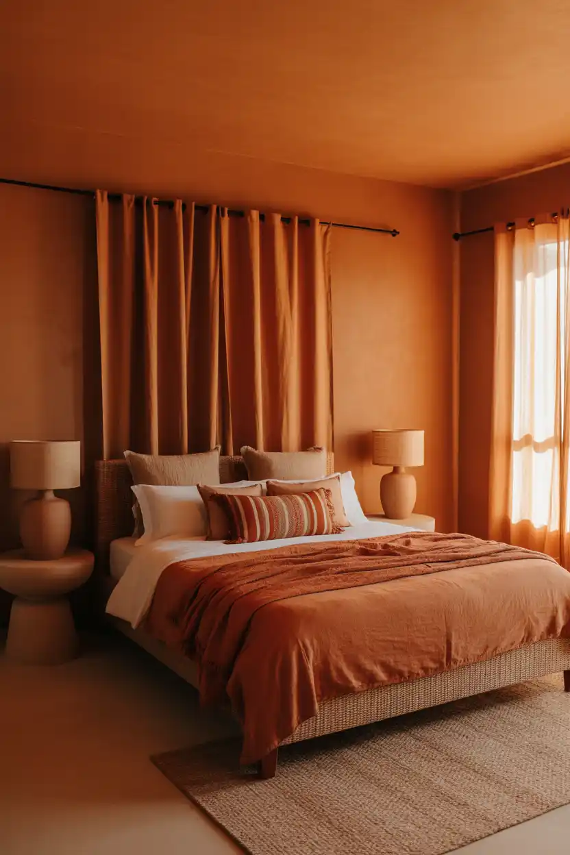
Terracotta brings warmth and personality to a bedroom without feeling overly bold, since its earthy, sun-baked undertone reads as grounded rather than bright. It works particularly well in rooms that could otherwise feel stark or under-decorated.
Pair terracotta with woven textiles, cream linens, and warm wood tones to lean into a bohemian or Mediterranean-inspired look. It photographs beautifully in warm, late-afternoon light, and it pairs surprisingly well with both vintage and modern furniture.
This colour is best suited to bedrooms with strong natural light and to people who want a distinct, characterful space rather than a strictly neutral one.
8. Muted Lavender
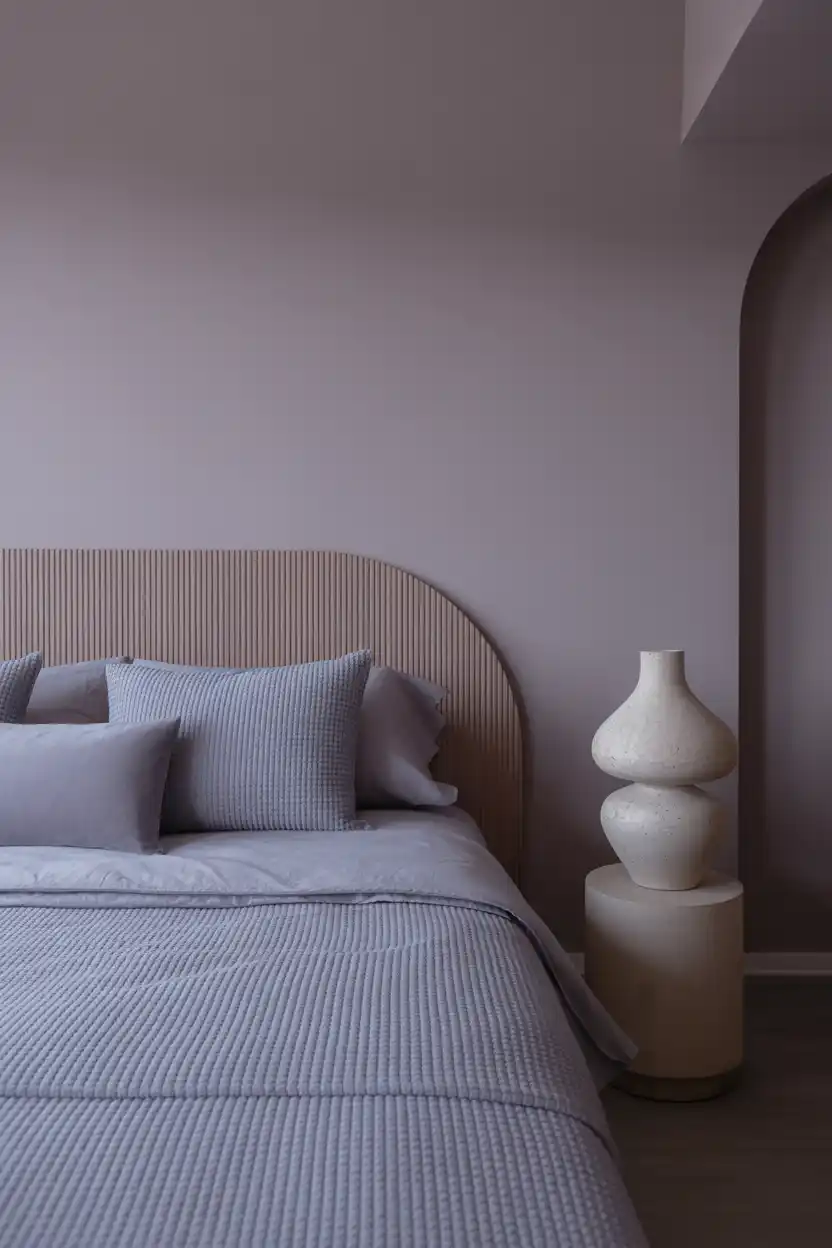
Muted, grayed-down lavender offers colour without sacrificing a calm, restful mood, which is why it is a common recommendation for bedrooms specifically designed for sleep. Its cool undertone works especially well in warmer, sun-drenched rooms that need balancing.
This shade pairs well with gray, white, or deeper plum accents, and it tends to look best in matte or eggshell finishes that soften its appearance. Because true lavender can skew purple in artificial light, it is worth testing swatches under the bedroom’s actual lighting before committing.
Muted lavender suits people who want a gentle pop of colour that still feels soothing, and it works particularly well in bedrooms used for winding down or meditation.
9. Forest Green
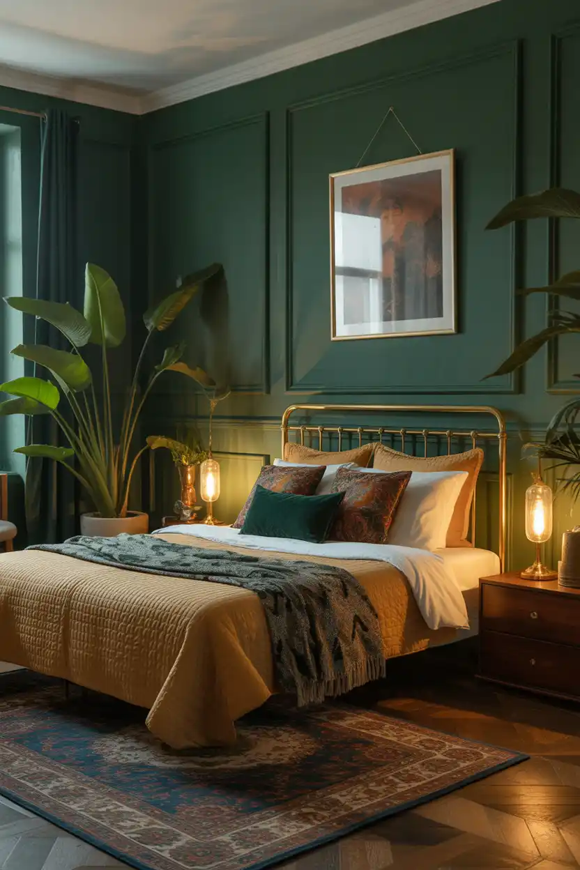
Deep forest green brings a rich, enveloping quality to a bedroom, similar to navy, but with an organic, botanical feel. It works particularly well when paired with plants, wood tones, and warm metallics, since these elements echo the colour’s natural inspiration.
This shade holds up well against patterned textiles and layered decor, making it a good choice for anyone drawn to a more maximalist bedroom style. Because it is a deep, saturated colour, it benefits from a lighter ceiling or trim colour to keep the room from feeling too enclosed.
Forest green suits bedrooms with good lighting and higher ceilings, and it is a favourite among people who want a dramatic, nature-inspired retreat.
10. Soft Butter Yellow
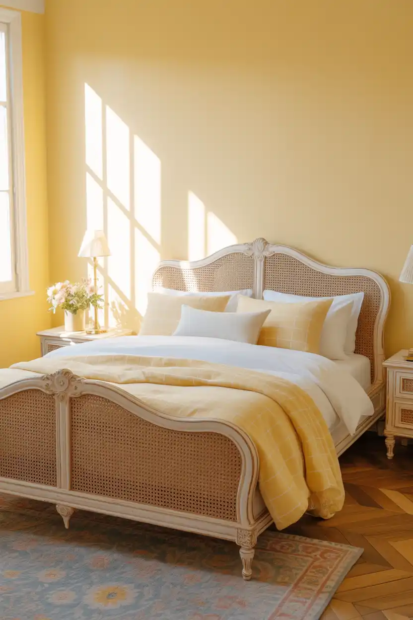
A soft, muted butter yellow brings warmth and cheerfulness to a bedroom without the intensity of a brighter yellow. It is particularly effective in rooms that lack strong natural light, since it visually mimics sunlight even on overcast days.
This shade pairs naturally with white trim, cane or rattan furniture, and light wood tones for a fresh, cottage-inspired feel. It is best kept to a muted or dusty version of yellow, since brighter tones can feel overstimulating in a room meant for rest.
Soft butter yellow suits people who want an uplifting, cheerful bedroom, and it works particularly well in guest rooms, kids’ rooms transitioning to more grown-up spaces, and smaller bedrooms that need a light-reflecting colour.
11. Dusty Blue
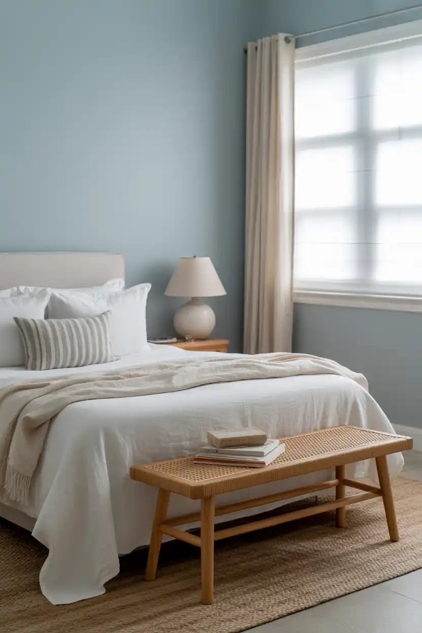
Dusty blue offers the calming qualities associated with blue tones but in a softer, more grayed-out version that feels easier to live with day to day. It is one of the most commonly recommended colours for bedrooms, specifically because of its associations with rest and lowered stress.
This shade pairs beautifully with white linens, natural wood, and woven textures for a relaxed, coastal-adjacent feel. It looks equally good in bright, sunny bedrooms and softer, north-facing rooms, which makes it one of the more flexible colour choices on this list.
Dusty blue suits anyone prioritizing a restful, sleep-focused bedroom, and it is especially popular in primary bedrooms and coastal or transitional-style homes.
12. Warm Taupe
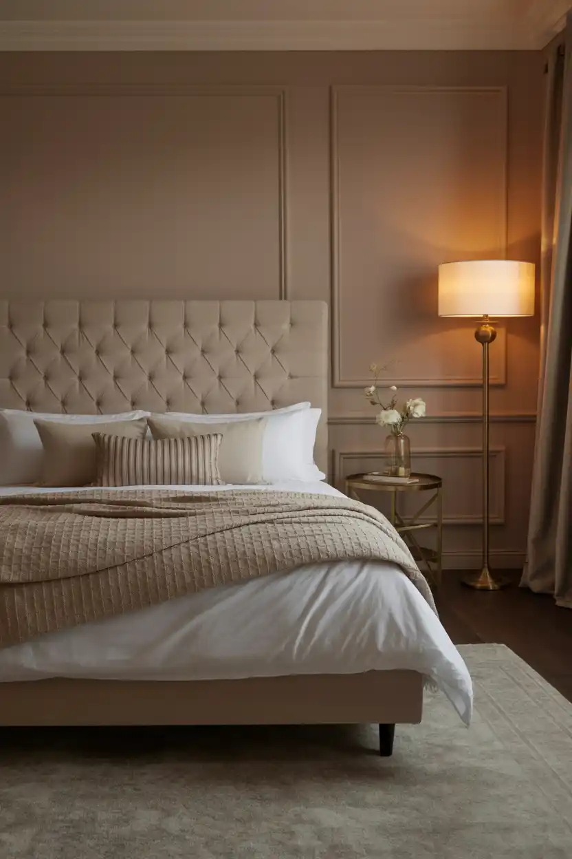
Warm taupe sits between beige and brown, offering more depth than a standard neutral while still functioning as a true backdrop colour. It tends to look sophisticated rather than plain, especially when paired with layered textures.
This shade works well with cream, chocolate brown, and brass accents, and it holds up nicely in both traditional and modern bedrooms. Because taupe can shift warm or cool depending on lighting, it is worth testing a sample against the room’s flooring and existing furniture before painting the full space.
Warm taupe suits people who want a refined, adaptable neutral that reads as more intentional than basic beige, and it is a strong choice for primary bedrooms meant to feel like a retreat.
13. Deep Plum
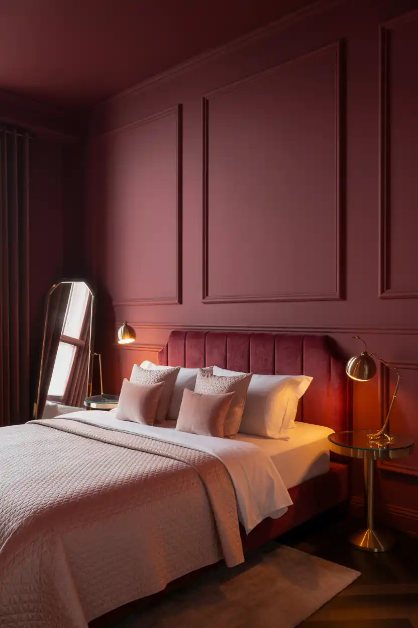
Deep plum or burgundy brings a jewel-toned richness to a bedroom that feels indulgent without being as stark as black. It is a strong choice for anyone who wants a colour-forward, dramatic space rather than a neutral one.
This shade pairs particularly well with velvet textiles, brass or gold accents, and cream or blush bedding to soften its intensity. Because it is a bold, saturated colour, it works best on an accent wall or in bedrooms with enough natural or layered lighting to keep the room from feeling too dark.
Deep plum suits people drawn to a more glamorous, statement-making bedroom, and it is especially popular in primary suites and bedrooms used mainly in the evening.
14. Classic White with Trim
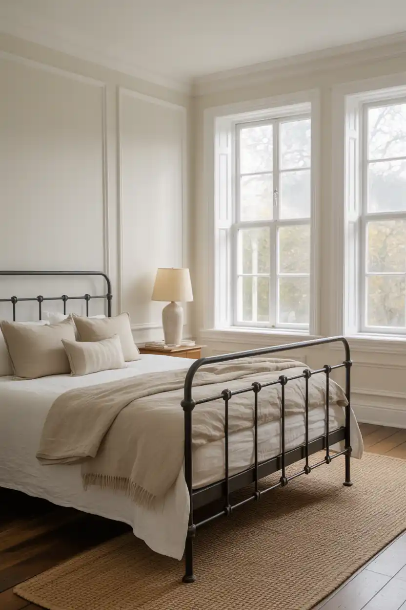
Classic white remains a foundational bedroom colour because of how much flexibility it offers. It reflects the most light of any colour on this list, making it the top choice for smaller bedrooms or rooms without much natural light.
White walls act as a blank canvas for bold furniture, colourful textiles, or artwork, and they pair with literally any style, from traditional to ultra-modern. The trade-off is that white shows scuffs and marks more visibly than deeper colours, so a washable, higher-sheen finish is worth the investment in high-traffic bedrooms.
This shade suits renters, minimalists, and anyone who prefers to express personality through furniture and decor rather than wall colour.
15. Moody Black
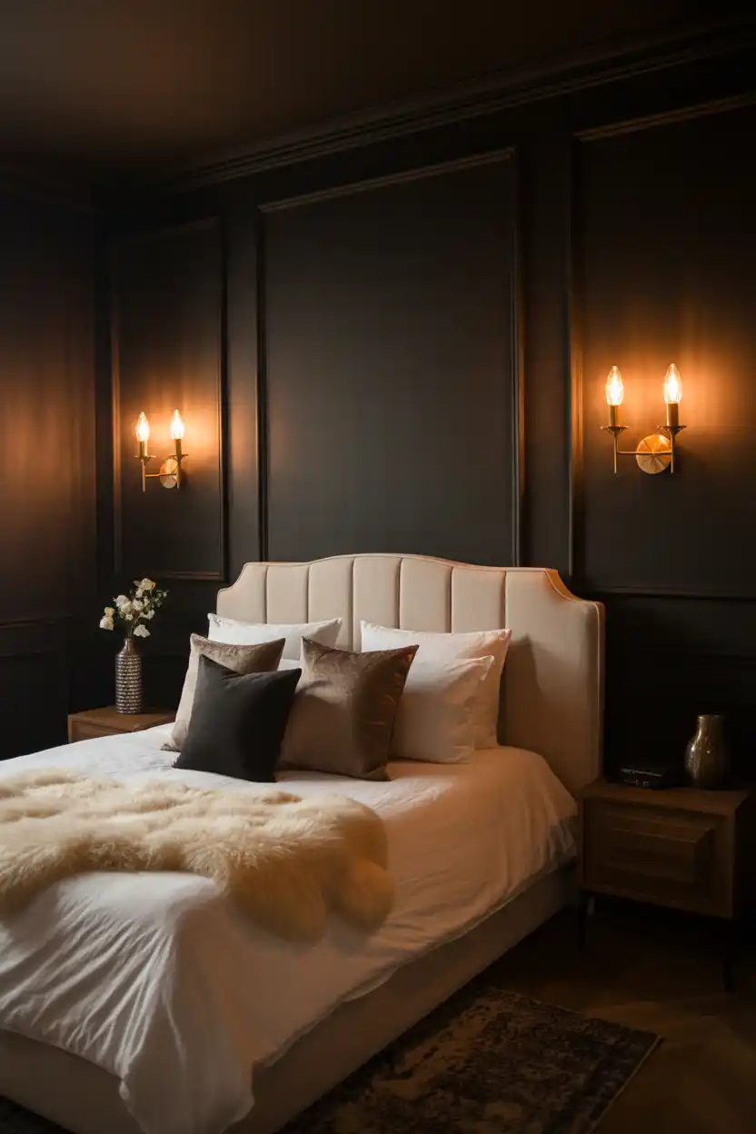
Moody black is the boldest option on this list, and it has grown in popularity as more homeowners embrace dramatic, hotel-inspired bedrooms. Rather than feeling cold, a matte black wall paired with warm lighting and soft textiles reads as cocoon-like and luxurious.
This shade depends heavily on lighting layers, since a single overhead fixture will make the room feel flat and dark. Warm sconces, table lamps, and dimmable fixtures are essential, along with cream or camel textiles to keep the space from feeling like a cave.
Moody black suits confident decorators with larger bedrooms and strong natural or layered lighting, and it works best as a full statement rather than a half-measure.
Planning and Buying Tips
A few practical factors make the difference between a bedroom repaint that looks professional and one that shows every flaw.
Space and light
- Test swatches on at least two walls and view them in morning, midday, and evening light before committing.
- In bedrooms under 120 square feet, stick to lighter or muted colours, or reserve dark shades for a single accent wall.
- North-facing rooms read cooler, so warm undertones help balance the light; south-facing rooms can handle cooler tones.
Setup and prep
- Patch and sand any holes or cracks, then apply a stain-blocking primer, especially over dark existing colours. Remove switch plates and outlet covers, and use painter’s tape along trim and ceiling lines for clean edges.
- Allow 24 to 48 hours of drying and off-gassing before sleeping in the room, longer for oil-based or high-VOC paint.s
Standard sizing and specs to shop for
- One gallon covers roughly 350 to 400 square feet per coat; most bedrooms need 1 to 2 gallons for two coats.
- Buy a sample size (typically 8 ounces) before purchasing full gallons
- Choose eggshell or satin finish for walls, and semi-gloss for trim and doors
Cost Breakdown
Costs vary based on paint quality, number of coats, wall condition, and whether you hire a professional painter.
Budget (DIY, standard paint): 150 to 300 dollars
Covers a standard latex paint, basic brushes and rollers, painter’s tape, and drop cloths for a typical 10-by-12-foot bedroom, done as a DIY project.
Mid-range (better paint or hired labour): 350 to 700 dollars
Includes a higher-quality paint or a professional painter for labour, plus proper primer and prep work on walls with minor imperfections.
Luxury/premium (specialty paint and full-service labour): 800 to 1,500+ dollars
Covers premium or designer paint lines, zero-VOC formulations, detailed trim work, accent finishes like limewash or Venetian plaster, and full-service painters handling prep, priming, and cleanup.
Paint Finish and Type Comparison
Finish affects both the look and the practical performance of your bedroom paint job.
| Finish / Type | Best For | Price (per gallon) | Durability | Performance Notes |
| Flat / Matte | Ceilings, low-traffic accent walls | $25 – $45 | Low – shows marks easily | Hides surface imperfections well, hardest to clean |
| Eggshell | Most bedroom walls | $30 – $55 | Moderate | Soft sheen, easy to spot-clean, most popular bedroom finish |
| Satin | Trim, doors, kids or high-traffic bedrooms | $35 – $60 | Good | More washable than eggshell, slightly more sheen |
| Semi-Gloss | Trim, moisture-prone areas | $35 – $65 | Very good | Highly washable, shows wall imperfections more |
| Standard latex paint | Budget projects | $25 – $40 | Moderate | Reliable everyday option from major brands |
| Premium / zero-VOC paint | Nurseries, sensitive sleepers, luxury finishes | $50 – $90 | Very good | Lower odour, richer colour depth, better one-coat coverage |
Maintenance Tips
- Dust walls periodically with a microfiber cloth or vacuum brush attachment to prevent buildup
- Spot-clean marks with a damp cloth and mild soap, testing an inconspicuous area first, especially on flat finishes
- Keep leftover paint labelled and stored in a cool, dry place for quick touch-ups later.
- Address moisture issues, like condensation near windows, promptly to prevent peeling or mildew.
- Avoid abrasive sponges or harsh cleaners on flat or matte finishes, since they can burnish or discolour the surface.
- Repaint trim and touch up high-contact areas, like around light switches, every 2 to 3 years, even if walls still look fresh.h
Frequently Asked Questions
What is the best paint colour for a bedroom?
There is no single best colour, but muted, low-saturation tones like sage green, dusty blue, warm greige, and soft gray consistently rank as the most calming choices for sleep-focused bedrooms. The right pick ultimately depends on the room’s natural light, existing furniture, and how bold or neutral you want the space to feel.
What colour should you avoid painting a bedroom?
Very bright, high-saturation colours like neon shades, bright red, or stark cool white are generally discouraged in bedrooms because they can feel overstimulating and interfere with a restful atmosphere. Bright red,d in particular, is often flagged for raising alertness rather than promoting sleep.
Should bedroom walls be a light or dark colour?
Both work well, and the right choice depends on room size, natural light, and desired mood. Light colours make small or dim bedrooms feel larger and airier, while dark colours create a cozier, more enveloping feel and tend to suit larger bedrooms with strong lighting.
What finish of paint is best for bedroom walls?
Eggshell is the most common recommendation for bedroom walls because it offers a soft, low-glare sheen while still being easy to spot-clean. Satin is a good step up for households with kids, pets, or higher wall traffic.
How much does it cost to paint a bedroom?
A standard 10-by-12-foot bedroom typically costs between 200 and 400 dollars in paint and supplies for a DIY job, or 400 to 900 dollars including professional labour, depending on the number of coats, wall condition, and paint quality selected.
How to Choose the Right Bedroom Paint Colour for You
The best bedroom paint colour depends less on what’s trending and more on three practical factors: how much natural light the room gets, how large or small the space is, and how you actually use the room day to day. Smaller or dim bedrooms tend to benefit from lighter, warmer neutrals, while larger rooms with strong lighting can handle deeper, more dramatic shades without feeling closed in.
Budget also plays a role in how experimental you can afford to be. A muted, classic tone offers the best long-term value if you want to avoid repainting soon, while a bolder colour is worth the investment if you are ready to fully commit to a style statement.
Ready to pick your shade? Grab a few sample pots from this list, test them on your actual walls, and live with them for a few days before you commit to the gallon.


- Be Respectful
- Stay Relevant
- Stay Positive
- True Feedback
- Encourage Discussion
- Avoid Spamming
- No Fake News
- Don't Copy-Paste
- No Personal Attacks
- Be Respectful
- Stay Relevant
- Stay Positive
- True Feedback
- Encourage Discussion
- Avoid Spamming
- No Fake News
- Don't Copy-Paste
- No Personal Attacks
